written for the forthcoming edition of sentAP magazine
video from the National Art Gallery made by Kamal Sabran
(Being a review of Zulkifli Yusoff’s National Art Gallery exhibition - Negaraku – Kuala Lumpur 26th July to 26th September 2010)
Negaraku translates as my country. For Zulkifli Yusoff that is the freshly liberated country – Malaya into which he was born in 1962. During August and September this year Zulkifli Yusoff’s latest exhibition reminded, revealed and suggested questions of what is ‘my’ country, that country to which we all relate uniquely, personally and individually.
The exhibition - Negaraku was a timely revelation of what could only have been Zulkifli Yusoff’s singular country - his personal milieu. In that exhibition the artist presented the country of his psyche, sometimes with nostalgia, sometimes with a crystal clear eye and mind. It is the country of the artist’s past, where he had grown and the experiences which had, to some degree, shaped the artist’s reality coupled with those things which had been shared with others within that unique entity - formerly Malaya which, since September 16th 1963, has been known as Malaysia.
The expansive and multi-layered exhibition straddled two galleries on the second floor of the Balai Seni Lukis Negara (National Art Gallery Malaysia) – Gallery 2A and Gallery 2B.
This was a well planned and crafted exhibition, presenting a variety of mediums, surfaces and imagery to keep the wandering visitor transfixed. Large acrylic canvases fused two of Zulkifli Yusoff’s best known styles – the ‘printed’ flat (Pop Art) style and the energetic ‘expressionistic’ style, into a surprising delight of essentially black and white fully laden, and ultimately deeply symbolic, imagery.
Why black and white - I don’t think that it had anything to do with Stevie Wonder and Paul McCartney’s ‘Ebony and Ivory’, Michael Jackson’s ‘Black or White’ or Subhash Ghai’s film of the same title – or maybe it has to do with all three. Perhaps it is because modern man is so conditioned to accept the viability of text and images if they are presented in black and white. If it’s in the newspaper it must be true; there it is, we say – ‘spelled out in black and white’, it’s official, it must be right because it’s printed (and read [red]) there in black and white.
Black and white, and of course sepia, are the colours of the past. B/W represents those intimate days of radio broadcasts, before TV created passive zombies. It is the colour of photographs, the colour of cherished memories, of past magazines in the days when the world was captured, for posterity, in lush black & white, or toned in that curious brown of sepia. Zulkifli Yusoff re-presented us with the marvel which is black and white and presented the greater part of his exhibition in these colours of memory and nostalgia.
We were informed, by a well placed black wall plaque with white text, that there were sub-headings for the exhibition. They were Patriotism, Economy, Government (broadcasts), National flower and Peace – 5 sub-headings in all, incidentally mirroring the petals of the Bunga Raya – the national flower.
To emphasise the overall point of nationhood and nostalgia, the exhibition ran over that period of time which incorporated both the Merdeka and Malaysia Day national celebrations, at a time when patriotism and nationalism is upper most in many people’s minds. The exhibition was, perhaps, a thoughtful and thought provoking counter to the worse extremes of jingoism.
The visitor moved past the hoardings announcing the exhibition - now in red, black and white and into the first gallery. It was there that the visitor encountered an installation of small print covered objects, reminiscent of those small collections by the American Surrealist Joseph Cornell; items neatly laid out in pleasing geometries, covered with print. On one papered box a printed hand of bananas was neatly offset by a small (yellow) ribbon bow, on another the image of a bitter gourd, yet another a cut durian. A paper and print covered wheelbarrow and two paper and print-covered, symmetrically placed child’s pull carts greeted the visitor with a calm, orderly vision setting out its wares in a carefully laid out display.
On the walls, on small printed blocks there were names of companies, like Felda, engaged with agriculture and types of barely remembered rice, past and present– Malinja, Mahsuri etc. Other wall blocks housed semi-3D imagery of fruit or prints of insects, fruit or vegetables. The visitor was alerted to the danger of the nation’s agriculture being relegated to museums – where only representations of reality may survive in image form, the original long since perished leaving wayan kulit shadows playing in Plato’s cave. The installation might have been titled ‘Memories of a rural past’, or ‘Boyhood in a rural setting’.
We moved swiftly on to Kebun Pak Awang II (Uncle Awang’s Garden II ) linked by content but not by style to the former. Kebun Pak Awang, many will recall, was the name of a popular Government radio programme, highlighting farmer’s problems, back in the 1970s.
Kebun Pak Awang II was the first large black and white canvas in the exhibition. The 244 x 366 cm canvas was dominated by a single phallic ear of sweet corn on the viewer’s left and images of bitter melons encased in a very feminine ellipse on the right. If this were an Indian painting I would been talking about lingam and yoni.
That painting was a stunning piece, beautifully rendered. Was it a wistful lament for missing fields of corn which once swayed adjacent to the kampongs under Malayan breezes - maybe. Was there interplay between the corn - brought to this country by foreign settlers and the indigenous vegetable bitter melon – a thought that the exhibition visitor may have pondered. Were we to read that corn plus bitter melon equals Malaysia being the child of foreign and the indigenous worlds combining, that is a thought.
Would I be naive to believe that the artist was alluding to radio broadcasts and his own controversial Professor Katak (frog) character from previous exhibitions, I wonder. FYI - Bitter melon is known as peria katak in Malay.
There was something reminiscent of the Puerto Rican artist Rafael Tufino’s linocuts, about this painting, perhaps it was the strong black and white lines coupled with the obvious fondness for the rurality of the image and the starkness similar to linocuts.
A large part of Zulkifli’s exhibition was devoted to Malaysia’s national flower (since 28th July 1960 that is) - the Chinese Rose Hibiscus (Hibiscus rosa sinensis), renamed the Bunga Raya. Songs devoted to the flower are woven across paintings, while images of the hibiscus flowers occur on etching plates, screen processed images and their painted forms appeared and re-appeared across a number of canvases, boards and surfaces either in full bloom or in bud – nascent or pre-nascent.
The multiplicity of hibiscus imagery begs the notion, and discourse, on the wanton use and misuse of imagery, thereby provoking endless conversations on the devaluing of one symbol, chosen out of a seven possible, to imbue national symbolism and therefore meaning into.
The Bunga Raya has come to be revered, amongst many other things, for its five petals representing the five principles of Malayan nationhood – Belief in God, Loyalty to King and Country, Supremacy of the constitution, Rule of law, Courtesy and Morality. It is laden with significance, symbolism and injected with meaning and it is no surprise that there is a proliferation of hairdressers, tourist spots, island resorts et al, all proudly proclaiming to be Bunga Raya - alluded to in Zulkifli’s work Kedai Gunting Rambut.
Popular 1960s songs (including those by M Noor and The Night Shadows etc) equated women to the Bunga Raya, unaware that the naming of things often reinterprets a symbol’s meaning. I hear a little bird called Andrew singing and a Belgian proudly proclaiming that this is not a pipe.
The hibiscus pièce d résistance, for me, was the large painted canvas replete with giant hibiscus flower, painted left of canvas, exposing its stamen as a dalliance for its audience, while balanced by its potted sister on the viewer’s right. The painting was a masterpiece, full of energy, vibrancy and gusto. A nice gesture was ‘alif, lam, lam, ha (or Allah) painted in Arabic, top right of canvas, reminding the viewer who is responsible for the delicate beauty of the Bunga Raya. That essentially ‘floral painting’ took the concept of floral painting not just to a new level, but defied the concept of levels altogether – Georgia O’Keefe eat your heart out.
In other, more personal works, the audience was introduced to Zulkifli’s mother (through collage) and his teacher father. The artist’s mother is represented through love hearts, scraps of 1960s radio, film and Wanita (Woman) magazines as well as Muslim readers and multiple images of Bougainvillea flowers under the title Koleksi Ibu (Mother’s Collection). At the end wall of Gallery 2A, one board had a ‘positive’ image of the artist himself, in red on board, while a corresponding board held a ‘negative’ image of the artist’s father, the two images were separated by an expanse of wood with the words to Malaysian jingoistic songs carved into them - the three works were called - Aku, Ayah dan Lagu Patriotik (My father and a patriotic song).
Finally we came to peace, or were at peace, represented by collages and wall mounted CND ‘ban-the-bomb’ signs in tubular metal – reminiscent of bicycles. Odd really that Gerald Holtom’s simple symbol, initially constructed out of the semaphore (flag signalling) letters N and D for the British Campaign for Nuclear Disarmament should have such resonance around the world as a universal sign for peace, and in Malaysia too.
In a series of works, in his exhibition, Zulkifli used that CND logo accompanied by another universal symbol, or rather two. Along with the CND sign Zulkifli used a hand sign universally acknowledged as being a sign for ‘peace’ – the two fingers rampant, palm outward, made popular by Winston Churchill. But if the visitor were to observe very closely, some of those hand images were reversed, an indication not of the universal sign for peace but the aggressive, insulting, V sign said to have derived from British battles with the French, the showing of bowmen’s two fingers.
There was a, ceiling mounted, projected film in Gallery 2B, but sadly on the day I viewed the film was too bright against the wall and all that could be seen were flashes of white light. Instead I listened to the dialogue and Kamal Sabran’s marvellous music.
Within the historical narrative which has become Zulkifli Yusoff’s work, time has moved on from those days of Malaya from before the artists’ birth to the 1960s and 70s. Yes, it is the artist’s remembrances, it is his country – Negaraku, but it is also the country of all those who have lived there and/or continue to live there. It is, to quote the often misquoted lines of Stephen Decatur’s sentiment - ‘our country, right or wrong’.
(Being a review of young Malaysian artists . new object(ion) at Galeri Petronas, KLCC.)
The new Galeri Petronas exhibition poses many poignant questions, for instance - what is the object of art, are there new objects of art (Object d’art?) fresh objections concerning art and/or why is there objectification in art. Doubtless the visitor will be unable to find the answers here, but the questions are posed afresh in the exhibition – ‘young malaysian artists . new object(ion)’ at Galeri Petronas, in KLCC, Kuala Lumpur for it is a collection of works by up-and-coming Malaysian artists.
In the sense of a collection it really is a veritable cornucopia of art - all shapes, sizes and pretentions. Some of the offerings will titivate some please, some annoy and others will have the visitor moving swiftly on to a more conducive piece - but that is the innate nature of diverse collections – it is to be expected and encouraged.
One slight grumble - concerning not the exhibition, but the catalogue - it is the image on the very first page of the catalogue which, we are told, denotes ‘Chilli Padi’ and ‘is synonymous with the young and fresh artistic representations showcased in OBJECT(ION)’, It is the image of an open electric blender - spewing blended chillies
I confess to being slightly confused. The Chilli image and metaphor is a good one; however there is scant connection between that image, the slight blurb about it and the actual exhibition. Admittedly red is used as the colour for the catalogue title and some of the internal pages, but you might have expected a little more connection to tie it all together – a chilli on the front cover perhaps. It is also a pity that there is no reference to the maker of that spewing blender image.
The exhibition, we are told, concerns either objects or objections - not chillies, unless, the chillies are the objects, or the objections. Ok, yes I get the concept - chillies equals hot equals bright new things equals new and exciting - but it is a little vague and perhaps needed a tad more thought to bring the disparate elements together. Perhaps it might have been nice to call the exhibition Chilli Padi, or simply Chillies, with a sub-heading of Young Malaysian Artists, maybe in brackets.
But where does the object or the objection come in other than in the internal text. Maybe my brain is too addled by fiery Malaysian sambal, but the discourse around objects, though admirable in themselves, needed to be less objective and more concerning the subject, i.e. the works themselves, which seemed to get lost amongst the intellectual dialogue - no I did not say onanism, though I was tempted. The subject, once covered, could then have meandered concerning the new object/objections, ramble through feminist dialogues of objectification even tipping a sonkok, mὰo zi or turban to Klein’s object theory discourse, if it so desired.
The exhibition has been described elsewhere as ‘brash, edgy and exciting’, which might have been once true, once, some way down the line but, perhaps, Malaysia’s 53rd year of independence from colonial rule deserves new adjectives for new art.
While Zulkifli Yusoff’s Negaraku exhibition, over at The National Art Gallery, celebrates concepts of independence and reminds Malaysians why it is so good to be independent from western colonialism, much of the Galeri Petronas exhibition seems to wallow in what Syed Hussein Alatas calls - the problem of the captive mind.
That is - a mind still held enthralled by its colonial masters in a post-colonial era or, as Alatas puts it, the captive mind is an ‘uncritical and imitative mind dominated by an external source, whose thinking is deflected from an independent perspective’. That is, simply, ‘cutting and pasting’ imagery, notions and ideas from a ‘Modern Art’ whose very foundation has been created, applauded and made significant by a culture which now re-colonises the rest of the world through new media and mediums. That is the real shock of the new.
Having said that, and accepting that all art is mimesis in some shape sense or form, this new exhibition does entertain and provides an eclectic enough selection of 40 young Malaysian artists to have something for everyone. At least one artist in the exhibition – Nurazmal Mohd Yusof (Ali Nurazmal) successfully uses western painting methods, and materials – acrylic on canvas, to deconstruct a colonial narrative with their image of a Malay man as puppet, strings on his fingers being pulled by his ‘colonial?’ masters, in the painting ‘Festival’.
But that, all pervasive, western imagery does seep through; so when confronted by Izzaddin Matrahah’s ‘The Lizard King’ (acrylic and collage on canvas) I must admit that I did a double-take. I was a great fan of The Doors, way back when and so was taken aback to see Jim Morrison and other images, straight out of his ‘The Celebration of the Lizard’, gracing Izzaddin Matrahah’s work. Though, perhaps, not quite so surprised to see ‘that rascally rabbit’- Bugs Bunny appear in Hoo Kiew Hang’s ‘Smiley Bunny’, or Muhd Sarip Abd Rahman’s menacing ‘Storm Trooper’ in his mixed media work ‘Playing with Inte”geli”ty’. These images are, after all, super-glued into contemporary popular culture.
Although the installations are there – from Rini Fauzan Mohd Zuhairi’s ‘Take Heed’ to Tan Nan See’s ‘I Wanna be a Contemporary Artist’ there is nothing indicating the magnificence of those recent installations by Zulkilfi Yusoff, though Liew Cheng Hua’s ‘The Kapitan’ points in that direction.
Some imagery, such as those acrylic paintings by Abdul Aziz Mohd Yusof, are very much of our time and sit nicely within a youth culture enamoured with graphic design, cartooning and comic books. This is work which would not look out of place in the design and illustration magazine - Territory, perhaps sitting alongside the works of Noor Azizan Rahman Paiman, Khairina Khairuddin or Tan See Ling - artists also featured within this exhibition.
The High and Low Art debate has been around probably as long as art itself has. What is fit for the wall or fit for the page – the contest continues, but there is a sense that with former graffiti artists like Jean Michel Basquiat becoming elevated to Fine Art the lines blurred even more, paving the way for young Malaysian artists like Abdul Aziz Mohd Yusof , Noor Azizan Rahman Paiman, Khairina Khairuddin and Tan See Ling to not even consider the boundaries of their work, or where it is more suitably placed – page or wall.
Once again there is little in the way of ‘new media’. Granted there is Wong Eng Leong’s 2 channel video projection ‘Vestige’ and Mohamad Fadly Sabran’s ‘Cyber Electro Evolution’ (mixed media and video projection) but still there is less experimentation than we are led to believe in the exhibition’s promotional materials.
The exhibition is a very small step in the right direction, but Malaysia’s art schools and collages need to get their noses out of western media, and mediums, and look to those more locally found, as well as seriously considering the interplay between traditional and contemporary, new and old media. On a personal note I should like to see young contemporary artists engaging with 3D design, modelling and rendering but not from a design/illustration perspective, but from a contemporary Fine Arts one.
Galeri Petronas continues to produce interesting and thought provoking exhibitions, you may not like all you see, for that is the beauty of it, but you will like some.
Understand that these images are not in any chronological order, neither of the time they were produced nor when I encountered them. These nine images are absolutely non-representative in-so-much-as the nine could be any nine at any point in time, and it just so happened that I picked these out of some metaphorical hat containing perhaps billions of images, at this particular moment in time. These images are not intended to be the best of anything, just available to my short-term memory at a singular moment in time.
The images of my youth, in particular those years between the ages of 17 – 21, have haunted me for the past three decades, some are represented here. So, in no particular order are nine images which, to some degree, have rocked my little world.
1ANDY WARHOL – VELVET UNDERGROUND WITH NICO – ALBUM COVER (1967)
Prince of Pop Art Andy Warhol suggested that we all might have 15 minutes of fame he, of course, had a great deal longer. This is Andy’s infamous Banana skin album sleeve to the Velvet Underground with Nico album (1967). The banana skin was peel-able, and when peeled revealed a very pink banana beneath – subtle huh! I first heard this album in 1968 and, as we used to say then, it blew me away. On occasions I still listen to this incredible album, in particular to Welshman John Cale’s electric viola and ‘ostrich tuned’ guitar. It was a milestone – I never imagined that music could sound like that, nor album covers peel.
2JIM STERANKO – NICK FURY AGENT OF SHIELD NO 7 – COMIC BOOK COVER (1969)
I had been ‘into’ comics since a very early age. I’ve been a comic book collector on and off for probably five decades and owned my own comic shop at one point. It just so happened that I saw this cover in 1969, just after the Rene Magritte retrospective at the Tate Gallery London. Admittedly this image is by Jim Steranko – one of the finest comic book artists, and references Dali rather than Magritte, but it reminds me of seeing Surrealist art for the very first time at that Magritte retrospective. Later I was to meet British Surrealist and jazz man George Melly and study Dali under Dali biographer - Dawn Ades. Many people forget the inextricable link between what is considered High and Low art, the many crossovers and referencing between arts. Comics/graphic novels have mostly had a raw deal when it comes to talking about art.
3ROGER LAW - AXIS BOLD AS LOVE – ALBUM COVER (1967)
Summer of LOVE, hippies, beads bells and incense – we were all into things Indian. The Beatles sojourned in Rishikesh, India, Donovan wore a paisley kaftan on the cover of The Best of Donovan. We all were listening to Ravi Shankar. Jimi Hendrix produced this album with a cover which spoke directly to his buying audience. It is a rip-off of a Hindu devotional poster – first indication of postmodernism perhaps or just a rip-off. I believe you can still buy the original posters in Brickfields or Jalan Musjid India, KL, sans faces of The Jimi Hendrix Experience. This gatefold sleeve doubled as a nifty poster to state you claim on your in-crowd of choice, reveal your tribal affiliations and display the lurking hippie for all to see, even if you didn’t have a convenient headband to wear. Oh and the music was, er, groovy man.
4DAVE GIBBONS – K ALBUM COVER FOR KULA SHAKER (1996)
Like the band Kula Shaker, the album cover was a retro gaze to the psychedelic era of the 60s, in some ways mimicking the Pop Artist Peter Blake’s 1967 Sgt. Pepper’s cover. It also looked back to albums like Roger Law’s Axis Bold as Love - Hendrix album cover. Again, it was a shrewd choice to have Dave Gibbons as the artist, as he is well known for his British comic strips - especially in 2000 AD and Dr Who, not to mention American works like Alan Moore’s The Watchmen and Green Lantern Corps. Let us not forget that band leader/frontman Crispian Mills is the son of 60s actress and all round groovy chick Hayley Mills. He was initiated into Gaudiya Vaishnavism and his Hare Krishna name is Krishna Kantha dasa.
5JIM FITZPATRICK – LUGH THE IL-DANA (1979)
I love this work because I was going through an ‘I love everything Celtic’ phase, which may or may not have anything to do with the fact that I am half Irish. This included buying all I could on Irish mythology including The Mythology of the British Isles by Charles Squire. It was then I came across the works of Jim Fitzpatrick – Celtia, The Book of Conquests, The Silver Arm and The Children of Lir. He had also designed many of the Thin Lizzy album covers at that time. That was round about the time I was using an airbrush to paint. I was commissioned to airbrush a series of ‘Hell’s Angels’ motorcycle petrol tanks. My showpiece was based upon Celtic mythology and included the warriors seen at the back of this picture – in silhouette. Many years later (in 2008) Jim Fitzpatrick was to comment on a digital work (Peace) that I had produced and had exhibited in Spain.
6BARRY WINDSOR SMITH – PANDORA (1975)
Known for his illustrations for Conan the Barbarian and ‘Art’ books like Opus, Barry Windsor Smith, in conjunction with Gorblimely Press, produced a number of stunning Fine Art print posters. Pandora was one such, available as a limited edition poster. It was one that I bought shortly after it came out, in 1975, and subsequently left in England when I came to Malaysia. Like the comic book artist P. Craig Russell there is always the Fine Artist trying to burst out from Barry Windsor Smith’s pen or brush. He treads lightly from the one world into the other, always leaving the faintest of scent of the Pre-Raphaelites wherever he goes.
7ROGER DEAN – TALES FROM TOPOGRAPHIC OCEANS, ALBUM COVER - YES (1973)
I admit to being a past YES fan. I was in a small town, in England, searching through a box of record albums in a second-hand shop. I saw this album cover and loved it, instantly. I bought the record and all the others with similar covers. There were four or five YES albums. Only later was I to love the music too. Roger Dean, airbrush artist and watercolourist extraordinaire, became an instant hero of mine way back in the days before Adobe Photoshop or CorelDraw. It was Roger Dean’s work which encouraged me to learn to use an airbrush.
8HECTOR HYPPOLITE – MAITRESSE ERZULIE (1948)
Hector Hyppolite, the Haitian naïf painter, was discovered by the American De Witt Peters. He helped Haitian artists set up their first art gallery. I came across this picture when I was studying for my first Master’s degree and taking Latin American art. My thesis for that course was Haitian Naive Art. Since then, this image reminds me of that course and the lovely people I met there.
Last but by no means least
9ZULKIFLI YUSOFF – MERDEKA 57 (2009)
It is difficult not to repeat myself when writing about Zulkifli Yusoff. This work was my introduction to the genius of Zulkifli Yusoff. It and I met face to face in Galleri Petronas and it was love at first sight, well at least for me it was. Like many other of Zulkifli’s works it resonates deeply, while casually appearing to be slight. It is the careful juxtaposition of the symbolic imagery which tantalises and teases the visual palette. As an introduction to Zulkifli’s work this installation was the best that I could have imagined.
All articles on this site are copyrighted to me - Martin A Bradley, please do not use, or extract from without permission
about me
Martin Bradley is a freelance author and researcher. He is, at times, an Art Critic, writer, graphic designer and exhibitions curator, currently back in the UK after being Covid 19 stranded in Cambodia for 15 months. He has volunteer taught Art History to young adults in Cambodia since 2012.
Martin has a Master's Degree in Art History and Theory from the University of Essex, England and a Master's Degree in Gallery Studies (Exhibitions and Displays) also from the University of Essex. His first degree was in Philosophy and he has diplomas in Art & Design, Graphic Design and Social Work. He is currently studying for his third Master's Degree and finished a Creative Writing course with the Writer's Centre Norwich (UK).
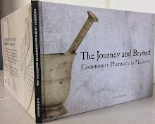
He is the author of a collection of poetry - Remembering Whiteness and Other Poems (2012) Bougainvillaea Press; a charity travelogue - A Story of Colors of Cambodia, which he also designed (2012) EverDay and Educare; a collection of his writings for various magazines called Buffalo and Breadfruit (2012) Monsoon Books; an art book for the Philippine artist Toro, called Uniquely Toro (2013), which he also designed, also has written a history of pharmacy for Malaysia, The Journey and Beyond (2014).
Martin wrote a book Calligraphyism about Modern Chinese Art with notable Chinese artist Luo Qi, from the China Academy of Art, Hangzhou, China (2017), and has had his book about Bangladesh artist Farida Zaman For the Love of Country published in Dhaka in December 2019.
He is the founder-editor of The Blue Lotus formerly Dusun an e-magazine dedicated to Asian art and writing, founded in 2011. Also the founder of Northern Writers, a venue for writers to read in northern Malaysia.
Martin was invited to read his poetry in Siem Reap, Cambodia (2013, in 2020 and 2021) and to The Philippines (twice in 2013). He was short story prize winner in the Warren Adler (USA) competition (2012) and invited to Delhi, India (2010) to read his poetry at the Commonwealth Writers Meet, he also had his Melvyn the Bomoh story serialised in the Australian webzine Specusphere (2009).
My Books
Commentary by Humanists: Martin Bradley
2022 New book by Martin Bradley about the Chinese artist Luo Qi
For the Love of Country
Biography of Bangladesh artist Farida Zaman 2019
Luo Qi Calligraphyism
Bio of Chinese artist Lou Qi (2017)
The Journey and Beyond
Community Pharmacy in Malaysia (2015)
Uniquely Toro
Filipino artist Toro, a retrospective (2013)
A Story of Colors of Cambodia
One story concerning the Cambodia children's charity Colors of Cambodia (2012)
Buffalo & Breadfruit
The trials and tribulations of an expat, 7 thousand miles from home (2012)
Going Ulu (column; Star Newspaper, Malaysia, fortnightly until Feb 2009) Another World (short story; guest columnist, Expat Magazine, Malaysia, November 2008) Building Group Malaysia (essay; Project Malaysia Org, on-line, 2008)
Book Anthologies
Awakening (short story; The Best of South East Asian Erotica, Monsoon Books, Singapore, 2010)
Colourful Language (essay; New Malaysian Essays II, Matahari Books, Malaysia, 2009)
Mat Rempit (short story; Urban Odysseys: KL Stories, MPH publishers, Malaysia 2009)
The Good Lieutenant (short story; Silverfish New Writing 7, Silverfish Books, Malaysia, 2008)
The Orchid Wife (short story; Silverfish New Writing 5, Silverfish Books, Malaysia, 2005)